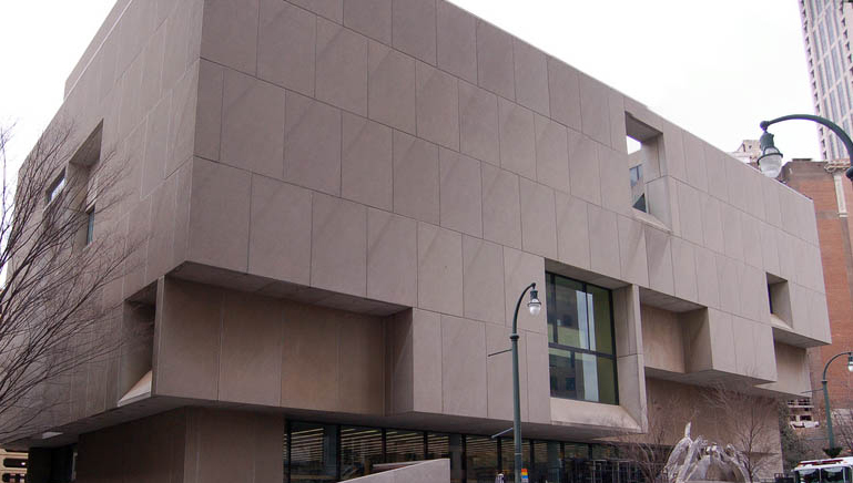
The National Trust Features Breuer's Last Design
Submitted by Eternity on Mon, 03/23/2009 - 20:53.

The National Trust for Historic Preservation:
Threatened in Atlanta: Breuer's Last Design
By Angela Serratore | Online Only | Mar. 23, 2009
Preservation Magazine - One of the most notable pieces of modern architecture in the American South may be demolished and replaced with a new design.
Local artist Max Eternity, along with New York University Breuer scholar Isabelle Hyman, have turned to the blogosphere as a grassroots method of garnering support for the library. To demolish a modern structure so integrated with its environment, Eternity writes on the blog, "seems sociologically, aesthetically, and historically incomprehensible—to say nothing of economically wasteful."
Read more.
|
Breuer's little "windows"
I understand that you (Eternity) are in Atlanta - while our recent Realneo Breuer preservation effort was here in Cleveland, Ohio. So it is pretty cool that our interests are convening here on the internet.
The Cleveland Ameritrust Tower designed by Breuer has a "window" similar to those in your photo.
What is the Bauhaus message which the "window" wishes to convey?
The Atlanta Breuer also has the matched stripe in the stone panels = like marquetry - this required precise quarry rockblock sawing and placement.
Attention to detail...
We don't see that today.
A General Lack of Cultural Maturation
Jeff,
Right. Attention to architectural detail does seem less evident in much of today's building style(s). Of course too, one has to remember that a collective firm -- contracting company -- with "balanced" tastes is not the same as, having at the helm, a purpose driven vision coming from a single mind; a disciplined genius like Breuer or Wright or Hadid or Gropius, etc.
The alchemy and dynamism of a town is conveyed through it shared civic values, and its property. Then there's the historical elements -- roots -- tying it all together; the good, bad, ugly. There's no overlooking whatever economic factors, and as much as we may try, race always plays some part, even if its just the issue of gentrification -- not to mention classism.
Still, what always comes back to my mind is the general lack of cultural maturation. Americans are too thin skinned when it comes to critical self-analysis and mirroring, and because of this (at least in part) we often fail when it comes to maximizing value placement on real wealth retention. And I'm not talking about the ever-changing stock market or Walmart. I'm talking about things that hold intrinsic wealth; embodied conceptualization -- realizations -- that may galvanize, but also challenge, unify and invigorate.
We need more REALNEO members from Atlanta
Damn are you good... both of you... I didn't even notice the stone cut detail.
Love the commentary... I'm learning lots from you guys - keep it up!
Save that Breuer!
Eternity - want to lead REAL COOP Atlanta?
Disrupt IT
Please post more Breuer Atlanta images
Images & Windows
There are several sites online, which host images of the Atlanta Breuer. I have copyright permission for some, but not all. So, because I myself am an artist -- having a definitive appreciation (and respect) for intellectual property -- here are links to images. And about the "window", yes, that is one of Breuer's signature attributes; usually having a real purpose. On the Central Library, concerning the glassless window, its at the 5th floor terrace, which provides stunning views of Atlanta's Downtown. Too this, on the link below for the DOCOMOMOga website, there is a picture taken from that "window." Still, my favorite window at the site is the street level 15' x 15' beveled window that looks in/out of the stairwell between the groud floor and the lower level (art gallery). Images of that can be seen on the Central Blogspot.
Image links:
DOCOMOMOga: http://docomomoga.org/wordpress/?p=146
Central Blogspot: http://centralbranchlibrary.blogspot.com/2009/01/szabo-pitts-sophmores-o...
Wikipedia: http://en.wikipedia.org/wiki/Atlanta-Fulton_Public_Library_System
Below is a picture of (I believe, not 100% sure) the 6th Floor pre-cast concrete, recessed grid ceiling. The picture was taken by Marty Branstiter, an artist colleague of mine.
And...I just found a whole load of pictures, which were taken from a lecture that was held a couple weeks back.